When I was young, there were always a few horses and ponies on our family farm. I was a pretty good rider. I even showed ponies in the 4-H children’s show at the local county fair.
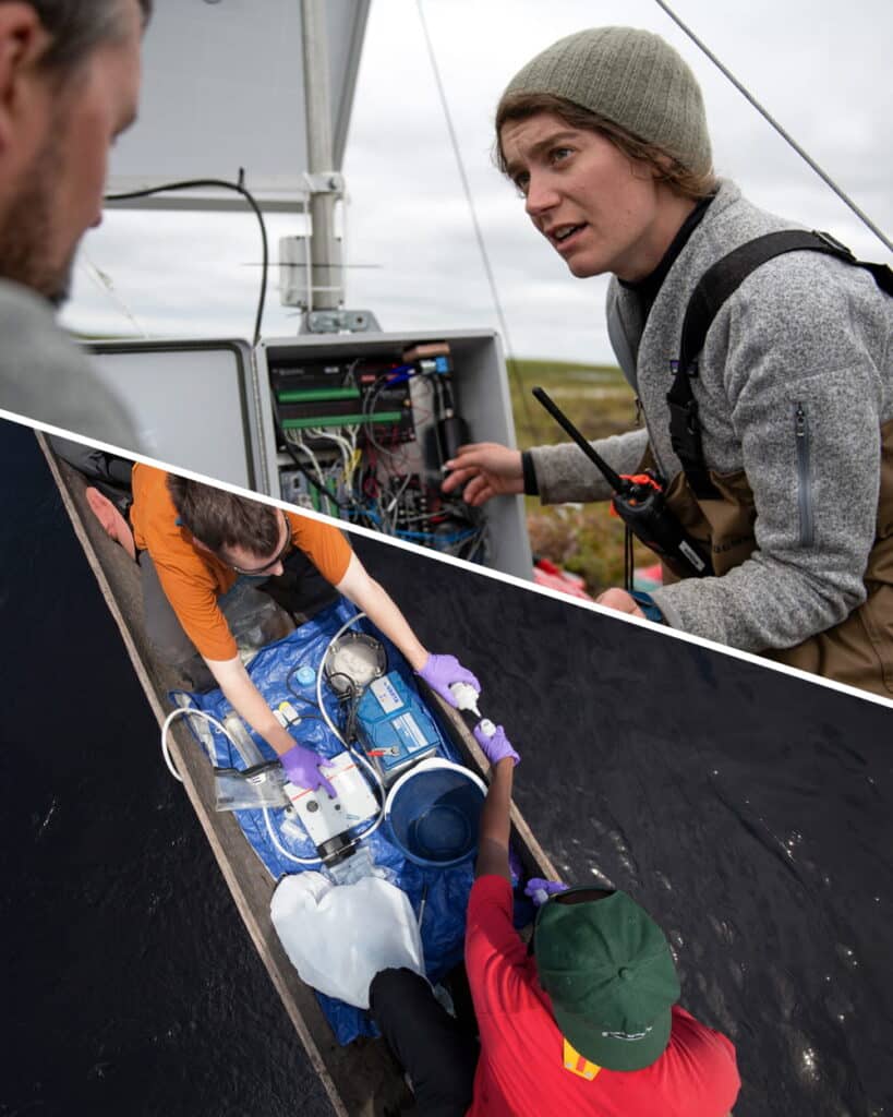
My previous horse experience, however, proved little help for the day-long horse riding treks I found myself on this summer during a spontaneous trip to Northwestern Mongolia with friend and colleague, Marina Tonkopeeva of the International Center for Reindeer Husbandry (ICR). We were there to visit indigenous Dukha reindeer herders in the Taiga regions near Tsagaannuur, not far from the Russian border. The only access to these remote communities, I quickly discovered, was by riding many hours on horseback. Our journey included two separate horse treks, one to the East Taiga camp, home to about a dozen herder families and a second to the more rugged West Taiga region, higher up in the mountains where we met with two families on a much smaller camp in their autumn location. I was forced to relearn horsemanship on the fly across the Mongolian wilderness and was wishing I still had the resilience and physical toughness of my youth.
The goal of this trip was exploratory. I hoped to connect with herders and introduce cartography as a powerful tool, and importantly to gain first-hand knowledge about the lands I would be mapping. From many other field trips in the past, I’ve learned that there is true inspiration in taking the time to travel to a field site. It allows me, as a cartographer, to build relationships and make connections between my virtual world of geospatial data and reality. Experiencing things like natural colors and landscape dynamics all help with making maps, post-trip. My goal was also to co-produce maps with the Dukha herders. Co-production of maps essentially means combining Indigenous knowledge with western science and cartography to communicate a story, based on mutual understanding and trust. Through the process of co-production, I can learn about the intended audience of our proposed maps, about how the maps will be used, and what story we will tell with the maps we make together.
With the help of our host and colleague, Khongorzul Mungunshagai, we met with many reindeer herding families and shared detailed satellite images inside their teepees. Over reindeer milk tea and cheese, we discussed migratory paths, seasonal camp locations, and shared stories about regional changes.
Indigenous communities across the planet have adapted to climate variability for millennia; however, the combined impacts of rapid warming and resource development are having an unprecedented impact on Indigenous peoples and their lands. Reindeer husbandry, which has been practiced for thousands of years, constitutes the modern-day livelihood of tens of thousands of Indigenous people who tend millions of domesticated reindeer on lands that span the Eurasian permafrost region. Traditional reindeer husbandry practices are now being challenged by loss of land due to development, conservation, and climate change.
The Dukha people of Mongolia, like other indigenous peoples, have lived respectfully and in harmony with the land since time immemorial; however, their lifeways are being challenged by land use decisions that have been implemented without proper consultation and consent. Impacts of these land use changes on traditional grazing lands are being further exacerbated by landscape and landcover changes associated with climate change including increased fire, permafrost thaw, and shrubification. This is of particular concern in Mongolia, where the rate of summertime warming is three times faster than the average for Northern Hemisphere lands, resulting in land degradation from permafrost thaw and changes in vegetation cover due to desertification.
Additionally, the Mongolian government’s new national parks have created unmarked boundaries and land-use restrictions that are essentially invisible lines of attack on the Dukha’s traditional lifestyle. They are being forced to alter ancient migration routes or grazing sites, and they often unknowingly cross park borders because the government hasn’t provided any clear, useful maps.
Woodwell Climate has recently awarded a Fund for Climate Solutions grant to continue this work. We plan to work closely with Dukha reindeer herders using GIS tools to map land use and land cover changes in Mongolia and their impacts on grazing lands. We will co-produce maps to support climate change research and advocacy for environmentally and culturally-just land management practices. This work would build on past co-production successes working with ICR and Sámi reindeer herders in Norway and with Indigenous communities in Alaska.
It’s clear that maps are a powerful medium for clearly communicating information and important stories. Whether I’m visiting politicians, working with scientists, or gathering in a teepee on the taiga, I’ve found that maps are always a welcome addition to the conversation and they help grease the wheels of communication. Leaving the Taiga and enduring the long trip home, I was physically worn out, but the vision of the Mongolian landscapes and the clarity in the work that lies ahead gave the long trip back purpose. I took home not just memories of making new friends (both two legged and four) and of a stunning ecosystem, but a commitment to help map a path forward with our partners at ICR and the Dukha.
Each year at the Mountainfilm documentary film festival a mural is erected on a coffee shop in downtown Telluride, Colorado— a mountain mining town turned world-class winter sports destination. The festival showcases films with thought-provoking themes including environmental justice, Indigenous sovereignty, racial equity, and our collective responsibility to care for the natural world. These murals carry those themes year-round, becoming an integral part of Telluride’s main avenue and vibrant art culture. Past murals have been commissioned from artists including Shepard Fairey and Banksy.
This year, Woodwell’s lead cartographer Greg Fiske was selected to display his maps as art for the mural wall. The resulting piece, “Cartographies of Arctic Change”, will remain in place until next spring, and shows the rapidly changing Arctic landscape as seen by Fiske during the process of turning satellite imagery into data used by the Center’s climate scientists. Here, Fiske talks about his process and thinking behind the creation of this mural:
SR: How did this opportunity come about?
GF: It kind of came out of nowhere. I certainly wasn’t expecting it when they said, “we think your stuff would look great on this wall. What do you think?” And I said sure!
Of course, I’ve never created a map this size (26.5 by 36 feet), so I was eager to experiment. We had to go back and forth about which of the maps would best suit the space, yet also tell a story that leads viewers to our science here at Woodwell.
SR: How did you decide on the final image?
GF: I was told that whatever you put on the wall tends to influence the feeling that you get while you’re sitting there, having your coffee. [The shop owners] said that they made a mistake one year putting up an image of something cold like an iceberg, and it kind of made the whole place feel cold and dreary. So when we selected the maps, we had to make sure that they didn’t make people feel awkward while sitting there enjoying the outdoor space.
We came up with the idea of multiple maps in strips instead of one big map to be able to have each map show something different, but could all have a single theme and tell a story.
SR: What is that story?
GF: “Cartographies of Arctic Change”— it’s what we look at on a regular basis within our geospatial analyses, modeling, and science here at Woodwell that indicates rapid change in the Arctic.
Each one of these slices in the mural, in addition to being beautiful art, are also actually the data that goes into the models that drive Woodwell’s Arctic science.
The Arctic is one of the fastest changing landscapes on the planet— melting ice, thawing ground, lakes forming or draining, less snow and more fires— and you get a unique view of those changes when you spend so much time looking at geospatial data and satellite imagery.
I’m one of the people who pull in this raw data and prepare it for others who may be creating models or mapping some element of a landscape. I look at this data and make sure it’s the right format, quality, and resolution to satisfy the needs of models, but in doing so, there are many cases where I’m like, “Wow, this is really beautiful. Other folks should see the data at this stage, instead of just the final product.” So some of those images are what ended up in the mural. I hope it can give the many viewers who will see it a new perspective on the impacts climate change is having on one of the most beautiful regions of the world.
SR: What does it mean to you to have been selected to showcase that beauty through this mural?
GF: Of course it’s an honor. It’s interesting to think about something that I’ve seen so many times at screen size or social media size now being amplified to building size. I’m super thankful to the folks at Mountainfilm and Telco for displaying our work. I’ve never seen any of my maps in mural format and I won’t actually know how it’ll look until I get to Telluride and see it in person. I’m super excited!
Explore these 15 maps by award-winning Woodwell Climate cartographers Greg Fiske and Christina Shintani. Created in 2024, each tells a story about the immense beauty of the high north, the dramatic changes unfolding as the Arctic continues to warm three to four times faster than the rest of the world, and the equitable solutions being developed to address climate impacts in the region
Read More on Permafrost Pathways.
“What if you’re not on the map?”
Dr. Kelsey Leonard of the Shinnecock Indian Nation addressed this question to a room of Geographic Information System (GIS) professionals at Esri’s global mapping conference in 2023. Leonard, who uses maps to advance Indigenous water justice, asks this question to raise awareness about the absence of Indigenous land and languages in GIS tools. The removal of traditional place names in physical spaces, cartographic maps, and geospatial software often contributes to the erasure of Indigenous culture and history.
The Permafrost Pathways project, like Leonard, is working to change that.
Read more on Permafrost Pathways
In a busy hallway of the Dena’ina Civic and Convention Center in Anchorage, Alaska, Arctic Communications Specialist, Jess Howard, and Climate Adaptation Specialist, Brooke Woods, stand in front of a large print-out of a map of Alaska. The map was created by Greg Fiske, Senior Geospatial Analyst at Woodwell Climate, to show the topography of the state in artfully shaded greens, browns, and whites. At the moment it is covered in handwritten notes.
Woods had suggested they bring the map to the Alaska Forum on the Environment (AFE) and invite conference attendees to add notes describing their community’s experiences with the impacts of climate change. Their table remained crowded throughout the day, as people stopped to point out the rivers and mountain ranges around where they lived, and swap stories about erosion, flooding, permafrost thaw, and missing species.
“Even on this huge map of Alaska,” says Howard. “People were coming up and immediately saying ‘there’s this river, there we are.’ Knowing exactly where to point was just so immediate because of the deep connection Alaska Native communities have to the land and water, of which they are the original stewards.”
Fiske who, alongside Cartographer Christina Shintani, leads the Center’s map-making activities, has seen many moments like this one over his decades-long career—moments where maps start conversations, foster connections, and get people thinking. It’s the reason he brings maps with him wherever he goes, and encourages others to do the same. It’s the reason he keeps a table at the Center’s offices covered in printed maps, sometimes finished pieces for display, sometimes draft versions to workshop.
Because when the maps come out, so do the stories. And the stories help us better understand our place in the changing world.
Making maps is a method of discovery
“But Google Maps exists. Haven’t all the maps been made already?”
Fiske and Shintani have heard it before: the idea that “everything has already been mapped.” Why should we create new maps of familiar places?
In a world beset by hundreds of transformative forces, of which climate change is one, Shintani responds that cartography is just as important now, if not more important than ever.
“The world is constantly changing,” says Shintani. “If it weren’t, we wouldn’t spend billions of dollars to capture satellite imagery every minute of the day. Political boundaries change every year, glaciers disappear, wildfires break out and alter the landscape, and we have to map the physical and social phenomena to understand that changing world.”
The act of creating a map can also be a method of revealing something new from existing data, which is why cartography plays a central role in research at Woodwell Climate.
Fiske and Shintani field frequent requests from scientists for maps to accompany research papers. According to Fiske, “sometimes the data for that is readily available, but sometimes it takes an entire geospatial analysis to derive what you need to make the map. And you won’t really know until you start iterating.” Often, viewing data on a map will inspire new scientific questions for researchers to chase down. The act of creating maps is not just an end product, it can be a critical step in the scientific process.
Cartography requires a little bit of everything
In their time at the Center, Fiske and Shintani have worked on maps detailing forest carbon in the United States, global drought forecasts, fire detections in the Amazon rainforest, and Arctic communities located on permafrost ground—they are no strangers to working across disciplines.
“Cartographers are generalists,” says Shintani. “We have to know a little bit about a lot of things, which actually benefits us as climate communicators, since the maps we’re making aren’t meant to inform other expert climate scientists, they are trying to convey information to everyone else.”
“Cartography isn’t really one profession,” Fiske clarifies. “It’s a collection of professions.”
A modern cartographer, according to Fiske, is a data analyst, a statistician, a designer, a programmer, a storyteller, and an artist all rolled into one. Skills from each profession, and a healthy curiosity about a hundred other topics, are required in order to create maps that are informative, attention-grabbing, and intuitive to read. Fiske entered into cartography through the world of computer coding, discovering an affinity for programming in his high school’s computer lab. He picked up the other skills later, with guidance from mentors, learning first to apply coding to geospatial data, and then how to display that data visually, and even make it beautiful.
Shintani’s entryway into cartography was through science. She had intended to study the physical geography of rivers, when a class on cartography changed her direction.
“With maps, I could organize everything in a way that made sense to me—because the world is so often organized in ways that don’t make sense—and I could make them beautiful,” says Shintani. “It was the first time I felt like I was really good at something.”
Fiske and Shintani’s cartographic talents eventually brought them both to Woodwell Climate, where their knowledge of various fields has helped them solve research questions and communicate new findings to the public.
“The day-to-day involves bringing together datasets, developing a clear story, making it look intuitive through design, taking the experts’ thoughts and data and making it a little more tangible for folks,” says Shintani.
To map something is to understand it
In another era, a cartographer might also have been somewhat of an adventurer—conducting expeditions to map hills and valleys, using mathematical conversions to capture the detailed curves of a coastline in a meticulously hand-drawn document. These days, cartography has much more to do with sitting behind a computer, manipulating massive datasets created by satellite observation and tweaking color pallets and font sizes using a variety of software.
The proliferation of satellite data has made the process of map-making much quicker and more accessible—no longer requiring long expeditions just to gather information on topography or ground cover. It’s allowed a shortcut to understanding the shape of places you’ve never been. A shortcut, Fiske says, but not a replacement.
“I would never have been able to make that map,” says Fiske, referring to the map of Alaskan topography that Howard and Woods brought to AFE, which earned him two awards from the Esri User Conference earlier this year. “If I hadn’t been to Alaska, seen it from an airplane, looked at those mountains, and seen what it looks like between the green valleys and the white glaciers.”
Travel is something Fiske believes should remain a part of the cartographer’s toolkit whenever possible, because a thorough understanding of a place is critical to being able to map it. Things like the natural colors of the landscape at different times of year, the true scale of glaciers when you are standing beneath them, the shape of a slumping and eroding hillside, give a fuller picture of the reality on the ground.
“A good map is a close connection to reality,” says Fiske. The closer to reality a map is, the more intuitive it is to orient yourself on it, understand the information the map is trying to convey. Fiske travels regularly, joining float trips with Science on the Fly or Permafrost Pathways’ visits to field sites and Alaska Native partner communities. He plays a role in the science, helping navigate and collect data, but values the experiences more for the insights he can use to inform future maps.
“If you’ve stood on the tundra,” he says. “Then you can make a better map of the tundra.”
A place in the world
A decade ago, Fiske recalls, he was helping a colleague map her work studying chimpanzees in the Congo Rainforest.
“We were going through and pulling coordinates out, sifting through notebooks that had obviously been sitting in the field for years, covered in water stains and mud.” They were overlaying documented nesting sites with data on forest type and at some point, Fiske turned around and realized she was in tears.
“Seeing it formulate on the screen, she was overcome with emotions,” says Fiske. “The map reflected what she had been carrying around in her mind the whole time.”
Maps, in Fiske’s experience, create instant—sometimes emotional—connections between people and places. They place individuals in the context of the wider world and put long-held ideas down on paper to be shared.
Which is why Fiske believes anyone can and should make maps. He has been helping the Permafrost Pathways team bring cartography into their work with Indigenous Arctic communities through a method called participatory mapping, which combines community input with technical expertise to create maps representing collective knowledge. Howard is also working with Fiske to create a digital version of his Alaskan topography map that incorporates the stories shared through the exercise at AFE.
Looking forward, Fiske wants to push his career more and more towards helping others create maps. Because everyone has stories to share about the places they know—whether they come from generations spent living on a landscape, or one lifetime’s work spent studying a single ecosystem.
“I want to help folks make maps,” says Fiske. “And tell their story.”