Explore these 15 maps by award-winning Woodwell Climate cartographers Greg Fiske and Christina Shintani. Created in 2024, each tells a story about the immense beauty of the high north, the dramatic changes unfolding as the Arctic continues to warm three to four times faster than the rest of the world, and the equitable solutions being developed to address climate impacts in the region
Read More on Permafrost Pathways.
In a busy hallway of the Dena’ina Civic and Convention Center in Anchorage, Alaska, Arctic Communications Specialist, Jess Howard, and Climate Adaptation Specialist, Brooke Woods, stand in front of a large print-out of a map of Alaska. The map was created by Greg Fiske, Senior Geospatial Analyst at Woodwell Climate, to show the topography of the state in artfully shaded greens, browns, and whites. At the moment it is covered in handwritten notes.
Woods had suggested they bring the map to the Alaska Forum on the Environment (AFE) and invite conference attendees to add notes describing their community’s experiences with the impacts of climate change. Their table remained crowded throughout the day, as people stopped to point out the rivers and mountain ranges around where they lived, and swap stories about erosion, flooding, permafrost thaw, and missing species.
“Even on this huge map of Alaska,” says Howard. “People were coming up and immediately saying ‘there’s this river, there we are.’ Knowing exactly where to point was just so immediate because of the deep connection Alaska Native communities have to the land and water, of which they are the original stewards.”
Fiske who, alongside Cartographer Christina Shintani, leads the Center’s map-making activities, has seen many moments like this one over his decades-long career—moments where maps start conversations, foster connections, and get people thinking. It’s the reason he brings maps with him wherever he goes, and encourages others to do the same. It’s the reason he keeps a table at the Center’s offices covered in printed maps, sometimes finished pieces for display, sometimes draft versions to workshop.
Because when the maps come out, so do the stories. And the stories help us better understand our place in the changing world.
Making maps is a method of discovery
“But Google Maps exists. Haven’t all the maps been made already?”
Fiske and Shintani have heard it before: the idea that “everything has already been mapped.” Why should we create new maps of familiar places?
In a world beset by hundreds of transformative forces, of which climate change is one, Shintani responds that cartography is just as important now, if not more important than ever.
“The world is constantly changing,” says Shintani. “If it weren’t, we wouldn’t spend billions of dollars to capture satellite imagery every minute of the day. Political boundaries change every year, glaciers disappear, wildfires break out and alter the landscape, and we have to map the physical and social phenomena to understand that changing world.”
The act of creating a map can also be a method of revealing something new from existing data, which is why cartography plays a central role in research at Woodwell Climate.
Fiske and Shintani field frequent requests from scientists for maps to accompany research papers. According to Fiske, “sometimes the data for that is readily available, but sometimes it takes an entire geospatial analysis to derive what you need to make the map. And you won’t really know until you start iterating.” Often, viewing data on a map will inspire new scientific questions for researchers to chase down. The act of creating maps is not just an end product, it can be a critical step in the scientific process.
Cartography requires a little bit of everything
In their time at the Center, Fiske and Shintani have worked on maps detailing forest carbon in the United States, global drought forecasts, fire detections in the Amazon rainforest, and Arctic communities located on permafrost ground—they are no strangers to working across disciplines.
“Cartographers are generalists,” says Shintani. “We have to know a little bit about a lot of things, which actually benefits us as climate communicators, since the maps we’re making aren’t meant to inform other expert climate scientists, they are trying to convey information to everyone else.”
“Cartography isn’t really one profession,” Fiske clarifies. “It’s a collection of professions.”
A modern cartographer, according to Fiske, is a data analyst, a statistician, a designer, a programmer, a storyteller, and an artist all rolled into one. Skills from each profession, and a healthy curiosity about a hundred other topics, are required in order to create maps that are informative, attention-grabbing, and intuitive to read. Fiske entered into cartography through the world of computer coding, discovering an affinity for programming in his high school’s computer lab. He picked up the other skills later, with guidance from mentors, learning first to apply coding to geospatial data, and then how to display that data visually, and even make it beautiful.
Shintani’s entryway into cartography was through science. She had intended to study the physical geography of rivers, when a class on cartography changed her direction.
“With maps, I could organize everything in a way that made sense to me—because the world is so often organized in ways that don’t make sense—and I could make them beautiful,” says Shintani. “It was the first time I felt like I was really good at something.”
Fiske and Shintani’s cartographic talents eventually brought them both to Woodwell Climate, where their knowledge of various fields has helped them solve research questions and communicate new findings to the public.
“The day-to-day involves bringing together datasets, developing a clear story, making it look intuitive through design, taking the experts’ thoughts and data and making it a little more tangible for folks,” says Shintani.
To map something is to understand it
In another era, a cartographer might also have been somewhat of an adventurer—conducting expeditions to map hills and valleys, using mathematical conversions to capture the detailed curves of a coastline in a meticulously hand-drawn document. These days, cartography has much more to do with sitting behind a computer, manipulating massive datasets created by satellite observation and tweaking color pallets and font sizes using a variety of software.
The proliferation of satellite data has made the process of map-making much quicker and more accessible—no longer requiring long expeditions just to gather information on topography or ground cover. It’s allowed a shortcut to understanding the shape of places you’ve never been. A shortcut, Fiske says, but not a replacement.
“I would never have been able to make that map,” says Fiske, referring to the map of Alaskan topography that Howard and Woods brought to AFE, which earned him two awards from the Esri User Conference earlier this year. “If I hadn’t been to Alaska, seen it from an airplane, looked at those mountains, and seen what it looks like between the green valleys and the white glaciers.”
Travel is something Fiske believes should remain a part of the cartographer’s toolkit whenever possible, because a thorough understanding of a place is critical to being able to map it. Things like the natural colors of the landscape at different times of year, the true scale of glaciers when you are standing beneath them, the shape of a slumping and eroding hillside, give a fuller picture of the reality on the ground.
“A good map is a close connection to reality,” says Fiske. The closer to reality a map is, the more intuitive it is to orient yourself on it, understand the information the map is trying to convey. Fiske travels regularly, joining float trips with Science on the Fly or Permafrost Pathways’ visits to field sites and Alaska Native partner communities. He plays a role in the science, helping navigate and collect data, but values the experiences more for the insights he can use to inform future maps.
“If you’ve stood on the tundra,” he says. “Then you can make a better map of the tundra.”
A place in the world
A decade ago, Fiske recalls, he was helping a colleague map her work studying chimpanzees in the Congo Rainforest.
“We were going through and pulling coordinates out, sifting through notebooks that had obviously been sitting in the field for years, covered in water stains and mud.” They were overlaying documented nesting sites with data on forest type and at some point, Fiske turned around and realized she was in tears.
“Seeing it formulate on the screen, she was overcome with emotions,” says Fiske. “The map reflected what she had been carrying around in her mind the whole time.”
Maps, in Fiske’s experience, create instant—sometimes emotional—connections between people and places. They place individuals in the context of the wider world and put long-held ideas down on paper to be shared.
Which is why Fiske believes anyone can and should make maps. He has been helping the Permafrost Pathways team bring cartography into their work with Indigenous Arctic communities through a method called participatory mapping, which combines community input with technical expertise to create maps representing collective knowledge. Howard is also working with Fiske to create a digital version of his Alaskan topography map that incorporates the stories shared through the exercise at AFE.
Looking forward, Fiske wants to push his career more and more towards helping others create maps. Because everyone has stories to share about the places they know—whether they come from generations spent living on a landscape, or one lifetime’s work spent studying a single ecosystem.
“I want to help folks make maps,” says Fiske. “And tell their story.”
Imagining Earth’s most probable futures
New climate education initiative portrays the warmer worlds we are likely to see this century, in hopes of preventing them
One point five—most readers will recognize that number as the generally accepted upper limit of permissible climate warming. With current temperatures already hovering at 1.1 degrees Celsius above the historical average, the race is on to hit that target, and the likelihood that we will surpass it is growing. Even if we do manage a 1.5 degree future, that’s still warmer than today’s world, which is already seeing devastating climate impacts.
So what will it actually feel like to live in a 1.5 degree world—or a 2 degree one, or even 3? The Probable Futures initiative has built a tool to help everyone imagine.
Building a bridge between science and society
Probable Futures is a newly launched climate literacy initiative with the goal of reframing the way society thinks about climate change. The initiative was founded by Dr. Spencer Glendon, a senior fellow with Woodwell Climate who, after investigating climate change as Director of Research at Wellington Management, noticed a gap in need of bridging between climate scientists and, well… everyone else.
According to Dr. Glendon, although there was an abundance of available climate science, it wasn’t necessarily accessible to the people who needed to use it. The way scientists spoke about climate impacts didn’t connect with the way most businesses, governments, and communities thought about their operations. There was no easy way for individuals to pose questions of climate science and explore what the answers might mean for them.
In short, the public didn’t know what questions to ask and the technical world of climate modeling wasn’t really inviting audience participation. But it desperately needed to. Because tackling climate change requires everyone’s participation.
“The idea that climate change is somebody else’s job needs to go away,” Dr. Glendon says. “It isn’t anybody else’s job. It’s everybody’s job.”
So, working with scientists and communicators from Woodwell, Dr. Glendon devised Probable Futures—a website that would offer tools and resources to help the public understand climate change in a way that makes it meaningful to everybody. The site employs well-established models to map changing temperatures, precipitation levels, and drought through escalating potential warming scenarios. The data is coupled with accessible content on the fundamentals of climate science and examples of it playing out in today’s world.
According to the initiative’s Executive Director, Alison Smart, Probable Futures is designed to give individuals a gateway into climate science.
“No matter where one might be on their journey to understand climate change, we hope Probable Futures can serve as a trusted resource. This is where you can come to understand the big picture context and the physical limits of our planet, how those systems work, and how they will change as the planet warms,” Smart says.
Storytelling for the future
As the world awakens to the issue of climate change, there is a growing group of individuals who will need to better understand its impacts. Supply chain managers, for example, who are now tasked with figuring out how to get their companies to zero emissions. Or parents, trying to understand how to prepare their kids for the future. Probable Futures provides the tools and encouragement to help anyone ask good questions about climate science.
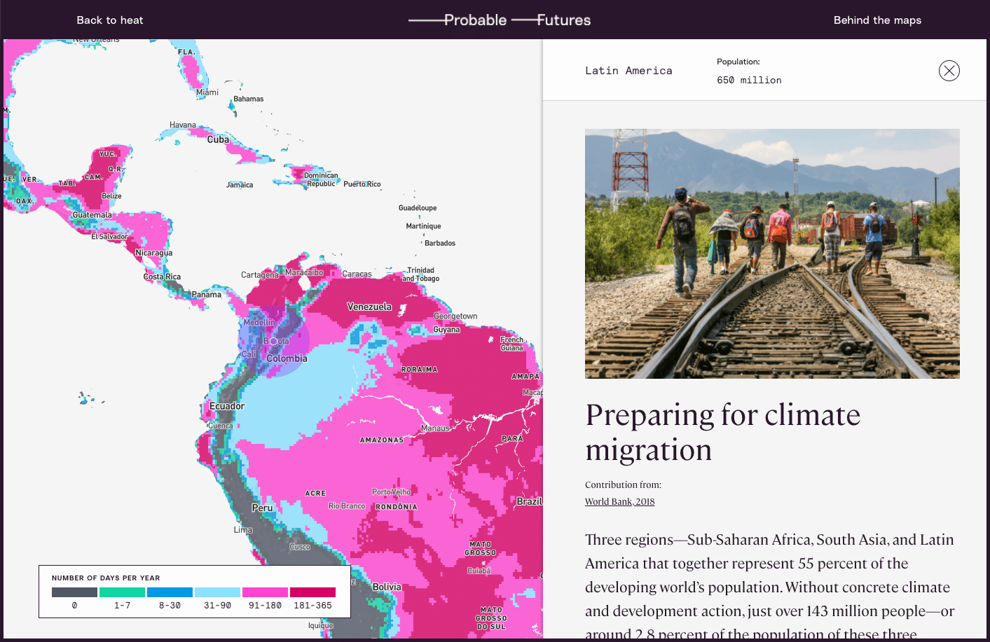
To that end, the site leans on storytelling that encourages visitors to imagine their lives in the context of a changing world. The maps display forecasts for 1.5, 2, 2.5, and 3 degrees of warming—our most probable futures, with nearly 3 degrees likely by the end of the century on our current trajectory. For the warming we have already surpassed, place-based stories of vulnerable human systems, threatened infrastructure, and disruptions to the natural world, give some sense of the impacts society is already feeling.
According to Isabelle Runde, a Research Assistant with Woodwell’s Risk Program who helped develop the maps and data visualizations for the Probable Futures site, encouraging imagination is what sets the initiative apart from other forms of climate communication.
“The imagination piece has been missing in communication between the scientific community and the broader public,” Runde says. “Probable Futures provides the framework for people to learn about climate change and enter that place [of imagination], while making it more personal.”
Glendon believes that good storytelling in science communication can have the same kind of impact as well-imagined speculative fiction, which has a history of providing glimpses of the future for society to react against. Glendon uses the example of George Orwell who, by imagining unsettling yet possible worlds, influenced debates around policy and culture for decades. The same could be true for climate communication.
“I’m not sure we need more science fiction about other worlds,” Glendon says. “We need fiction about the future of this world. We need an imaginative application of what we know.” Glendon hopes that the factual information on Probable Futures will spark speculative imaginings that could help push society away from a future we don’t want to see.
For Smart, imagining the future doesn’t mean only painting a picture of how the world could change for the worse. It can also mean sketching out the ways in which humans will react to and shape our new surroundings for the better.
“We acknowledge that there are constraints to how we can live on this planet, and imagining how we live within those constraints can be a really exciting thing,” Smart says. “We may find more community in those worlds. We may find less consumption but more satisfaction in those worlds. We may find more connection to human beings on the other side of the planet. And that’s what makes me the most hopeful.”