30 Day Map Challenge 2022
The 30DayMapChallenge is a social media based mapmaking challenge open to everyone. Each November, participants from all over the world create a new and original map for 30 days, where each day has a unique theme. In 2022, Woodwell Climate Research Center participated as an organization, including as much of our work as possible while still adhering to the map categories.
Day 1: Points
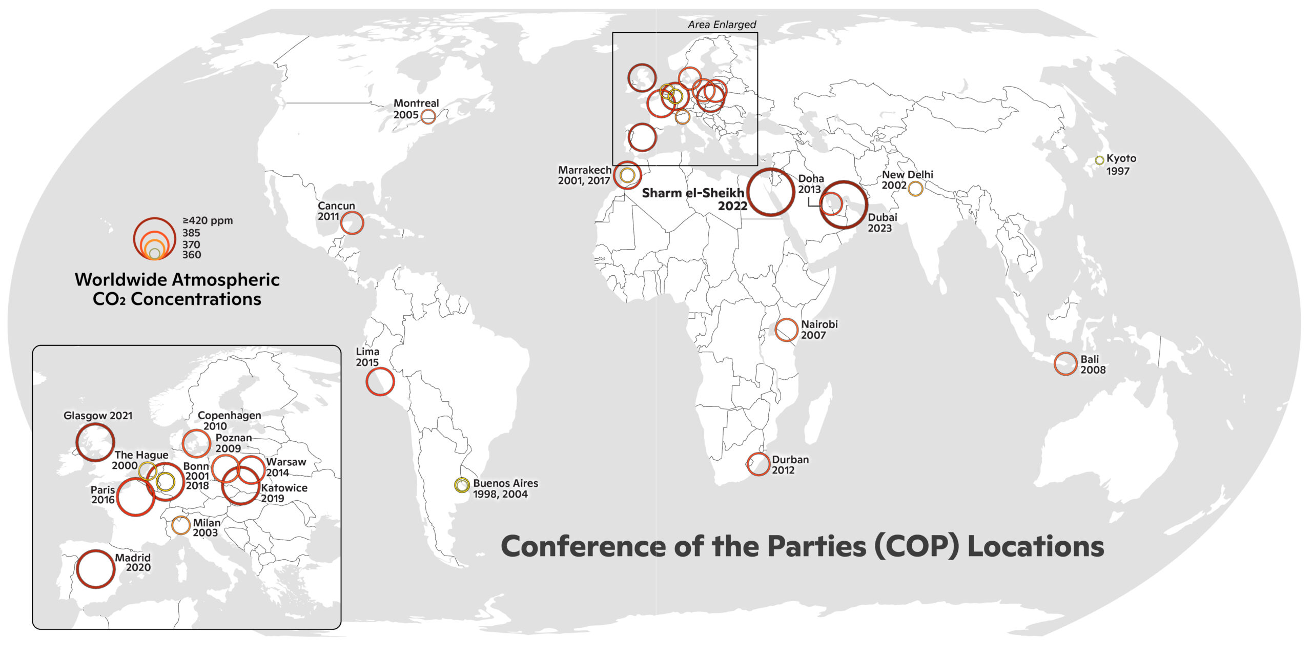
As Woodwell geared up for COP27 in Egypt November 6-18, this map shows all the past 26 meetings along with the worldwide CO2 concentrations for the year of that meeting. / map by Greg Fiske
Day 2: Lines
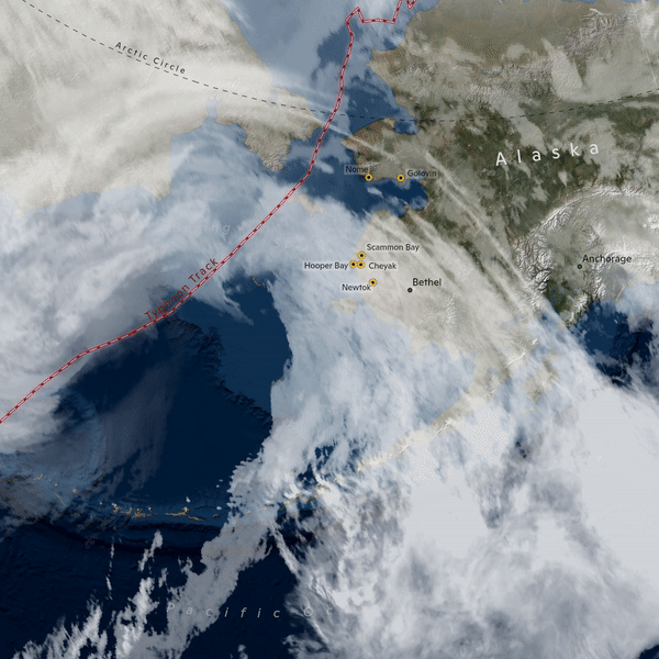
The path of the recent and devastating Typhoon Merbok. Big storms like this one are becoming more common in Alaska with climate change warming Arctic waters. / map by Greg Fiske
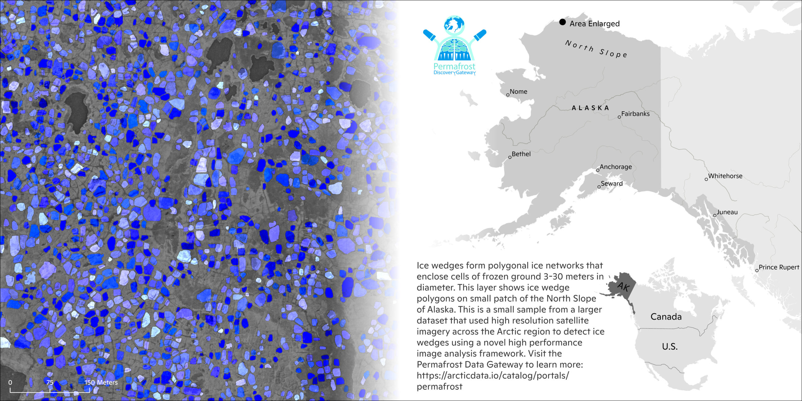
Day 3: Polygons
An ice wedge is a crack in the ground formed by a narrow piece of ice. The formation of ice wedges follows a complex pattern called “ice wedge polygons.” Woodwell’s Anna Liljedahl leads the Permafrost Discovery Gateway, a site that maps these polygons to better understand changes in the Arctic. / map by Greg Fiske
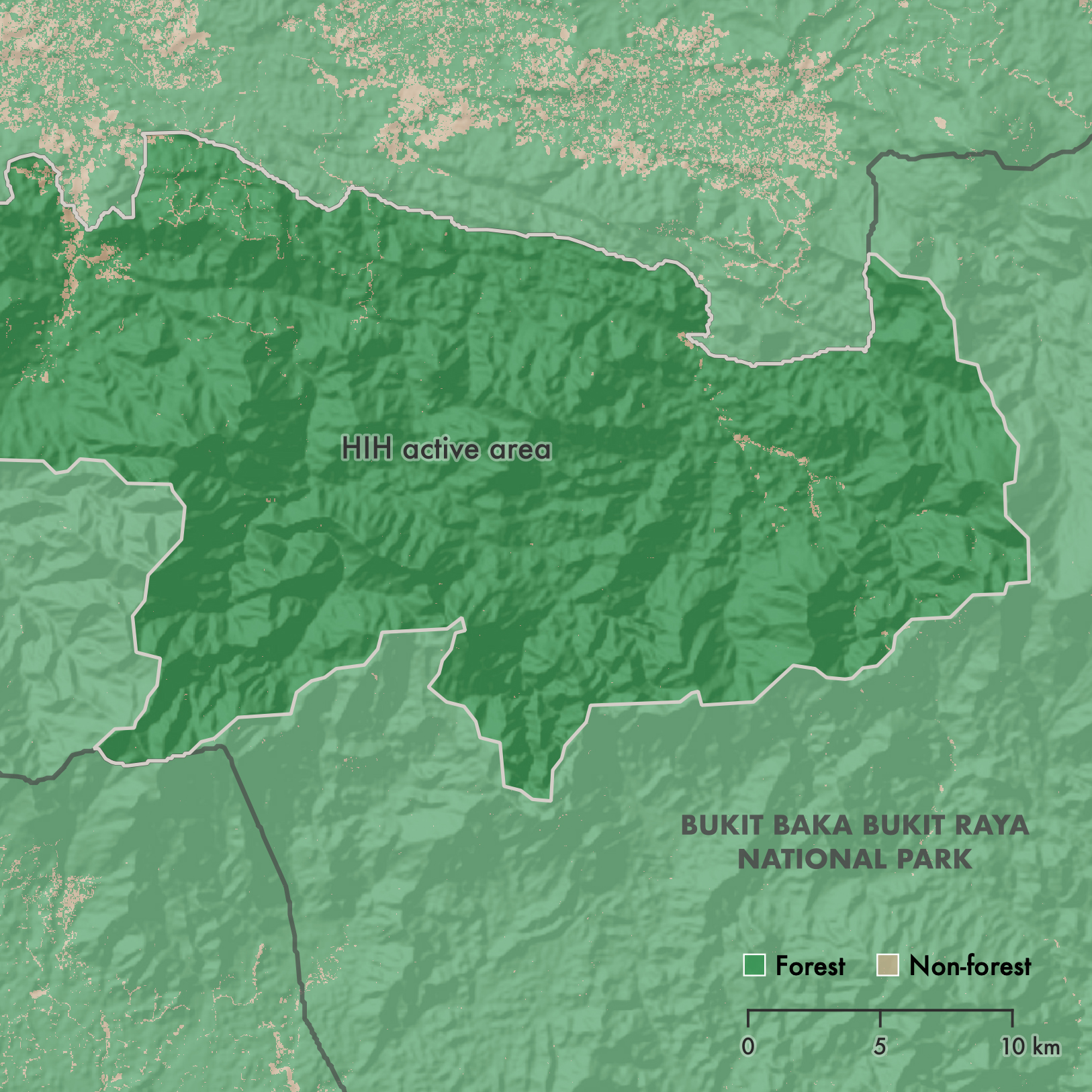
Day 4: Green
It’s nice to see all this green, representing standing forest, in Bukit Baka Bukit Raya National Park, where Indigenous Dayak communities have been working with Health in Harmony and Alam Sehat Lestari. / map by Emily Sturdivant
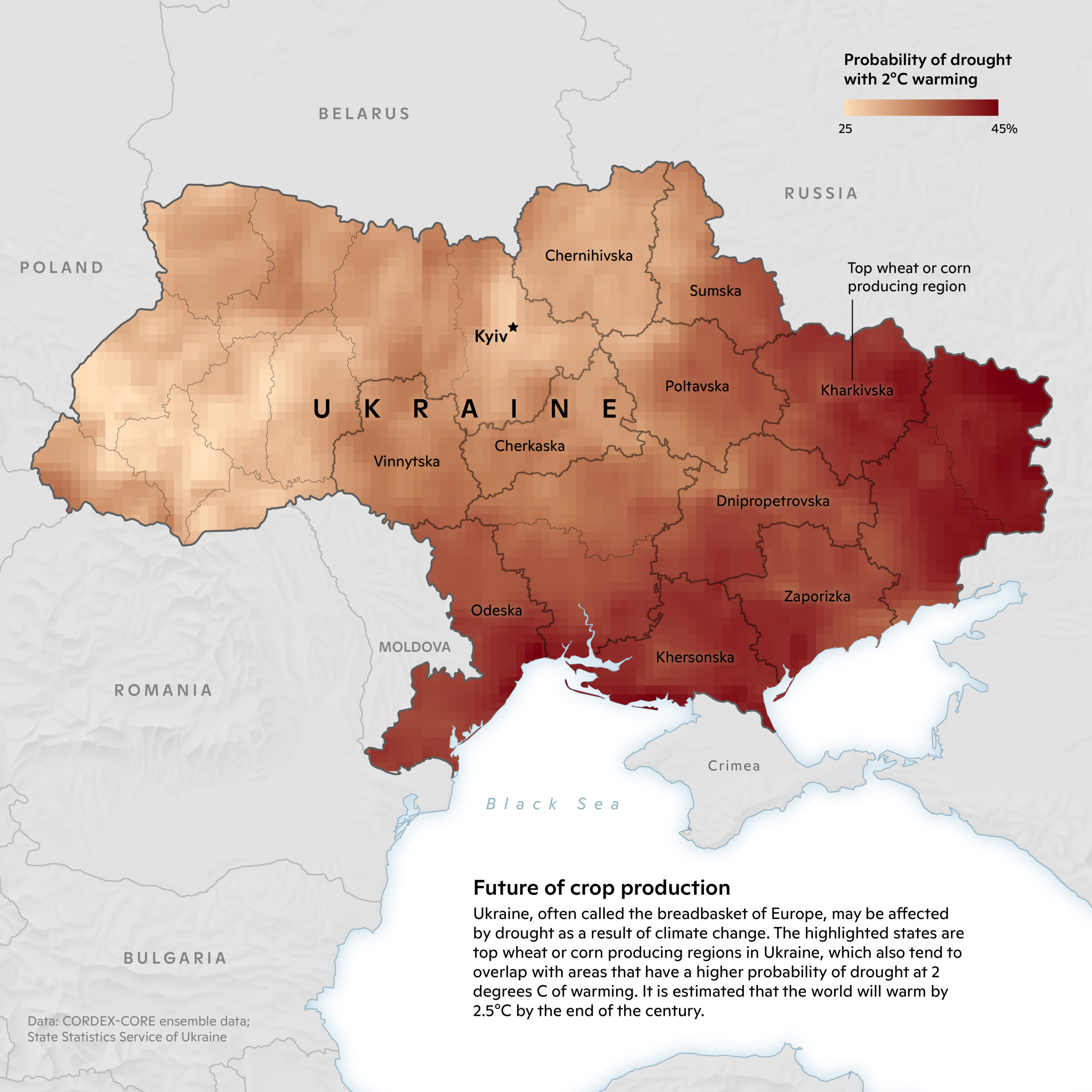
Day 5: Ukraine
The war in Ukraine has disrupted a large portion of Europe’s crop production. Climate change-induced drought also threatens the country’s cropland. / map by Christina Shintani
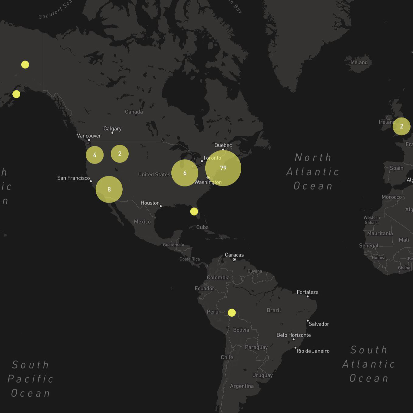
Day 6: Network
Woodwell staff are scattered about the globe, yet work seamlessly in a mind-bendingly powerful climate solutions team. / map by Greg Fiske
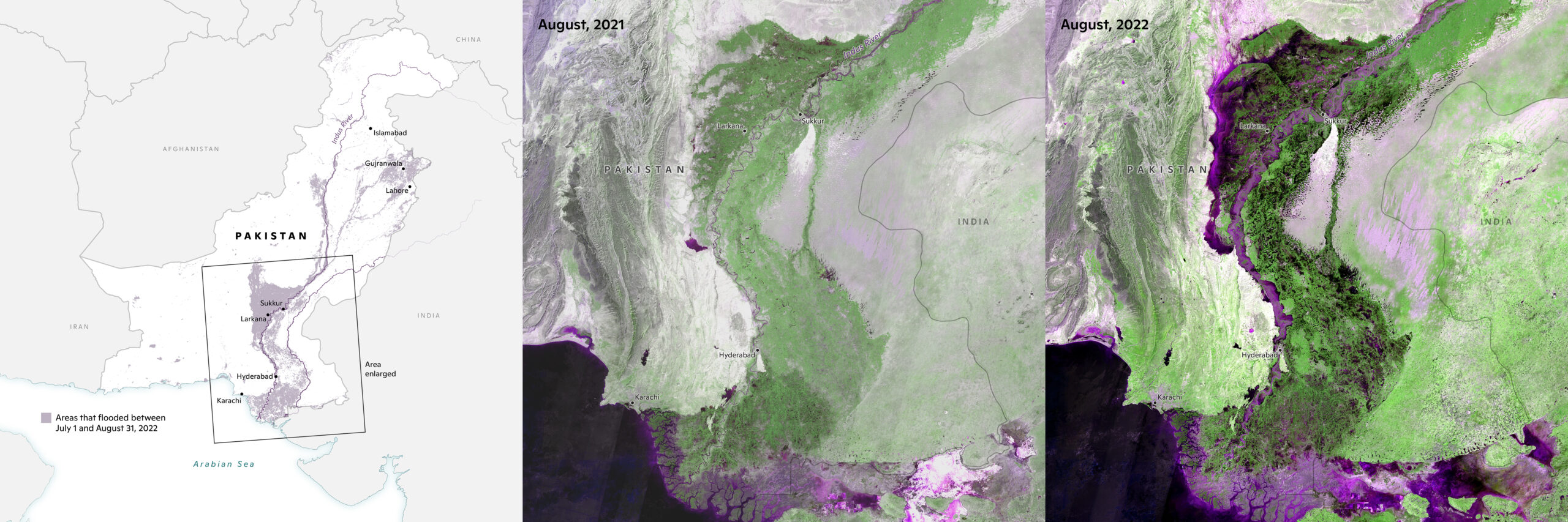
Day 7: Raster
Before and after images of the recent, devastating floods in Pakistan. / maps by Christina Shintani
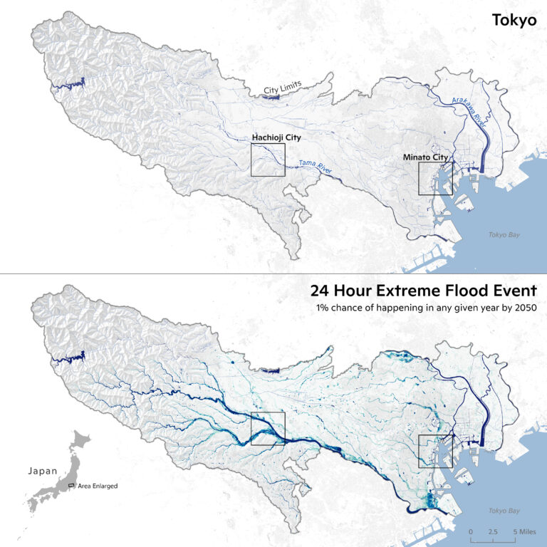
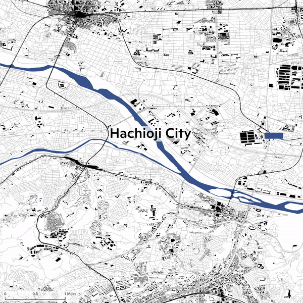
Day 8: Open Street Map (OSM)
Open Street Map can get us on the ground for a closer look at how cities will fare with increasing climate change risk, like these Woodwell-generated maps of flood modeling in Tokyo—a city with a huge population at the water’s edge. / map by Greg Fiske
Day 9: Space
A beautiful Sentinel2 satellite image taken from space, this map shows the Yukon-Kuskokwim Delta region of Alaska. / map by Greg Fiske
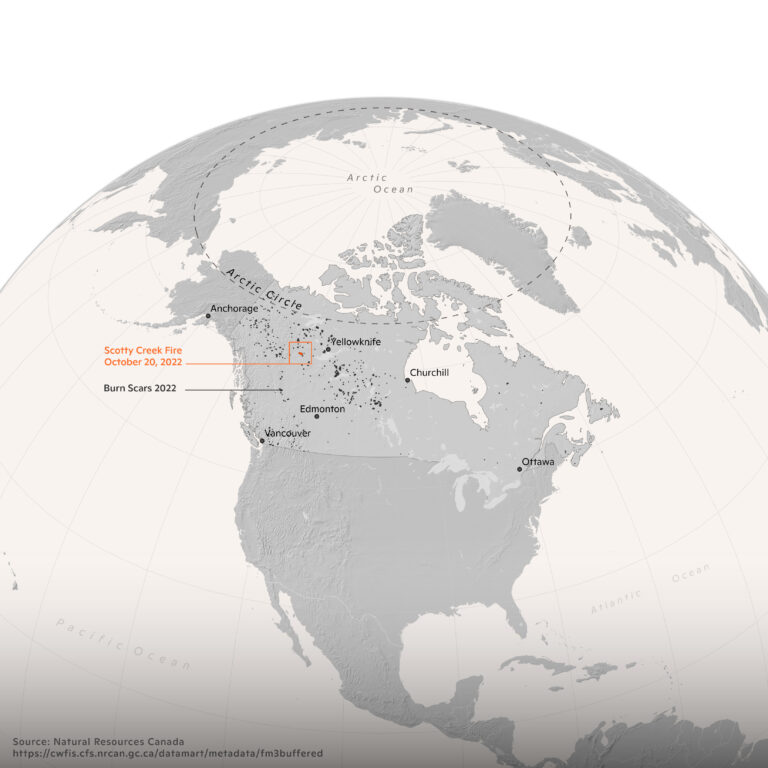
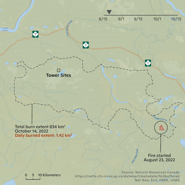
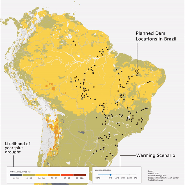
Day 10: Bad Map
This is a bad map (i.e. a map of a bad situation). The Scotty Creek Fire in NW Canada is an extreme anomaly for this time of year and destroyed nearly one million dollars worth of research and climate monitoring equipment run by Łı́ı́dlı̨ı̨ Kų́ę́ First Nation. Climate change only makes studying climate change more difficult. / map by Greg Fiske
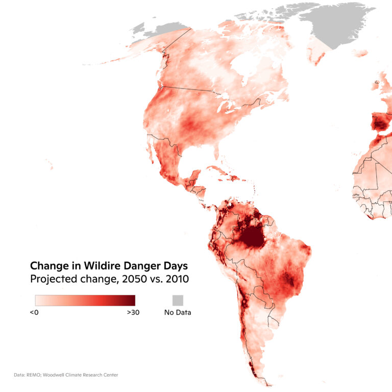
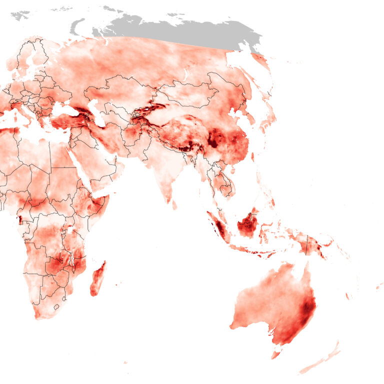
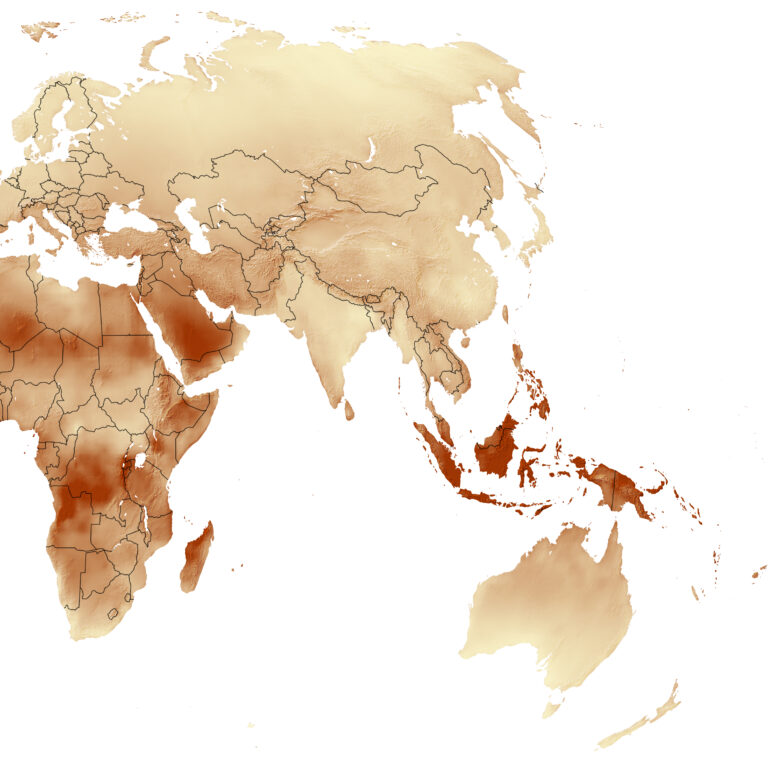
Day 11: Red
This map depicts global wildfire danger days, where the Fire Weather Index value—a measure of fire intensity—exceeds the historical (1971–2000) 95th percentile value. / map by Christina Shintani
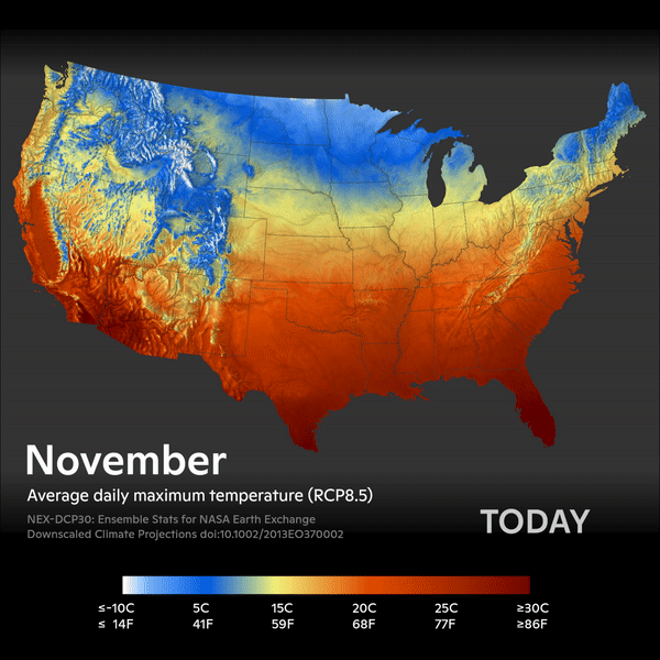
Day 12: Scale
What will it be like doing the 30-Day Map Challenge in 2050? Woodwell relies on downscaled climate scenario data for regional modeling of our future climate. In the United States, the data can be as fine as 1km resolution thanks to the high number of data points. / map by Greg Fiske
Day 13: Five-Minute Map
ProbableFutures works closely with Woodwell scientists to provide climate map data in a format that is easily digestible for exploration. This five-minute map was created using the new PF mapping tool, which is currently in alpha testing phase and seeking users. / map by Greg Fiske
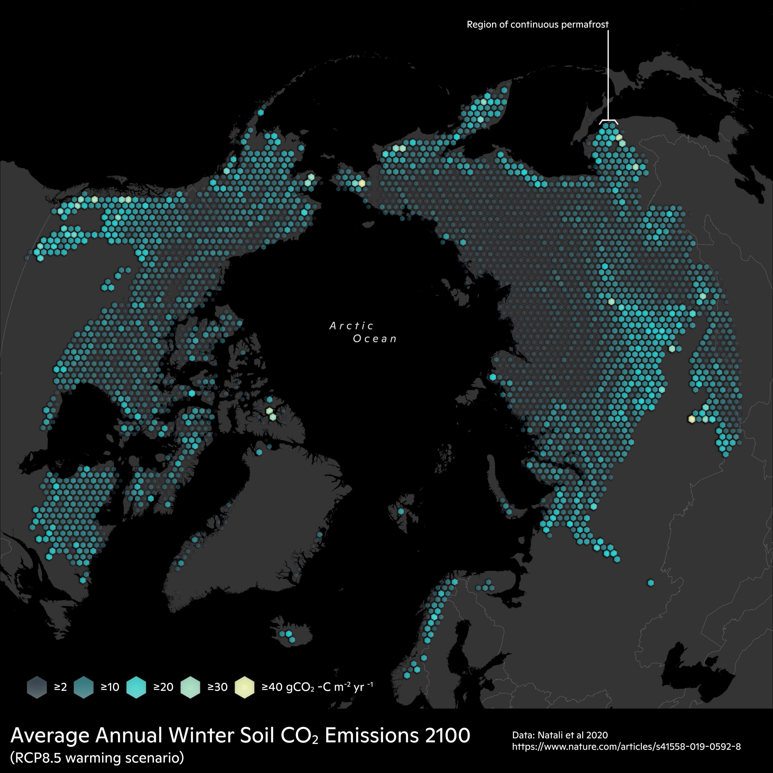
Day 14: Hexagons
An old Lite-Brite picture or a cool map of winter soil respiration in the Arctic? / map by Greg Fiske
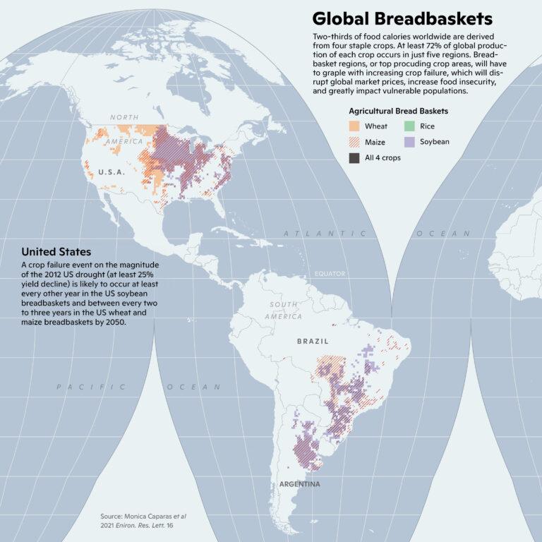
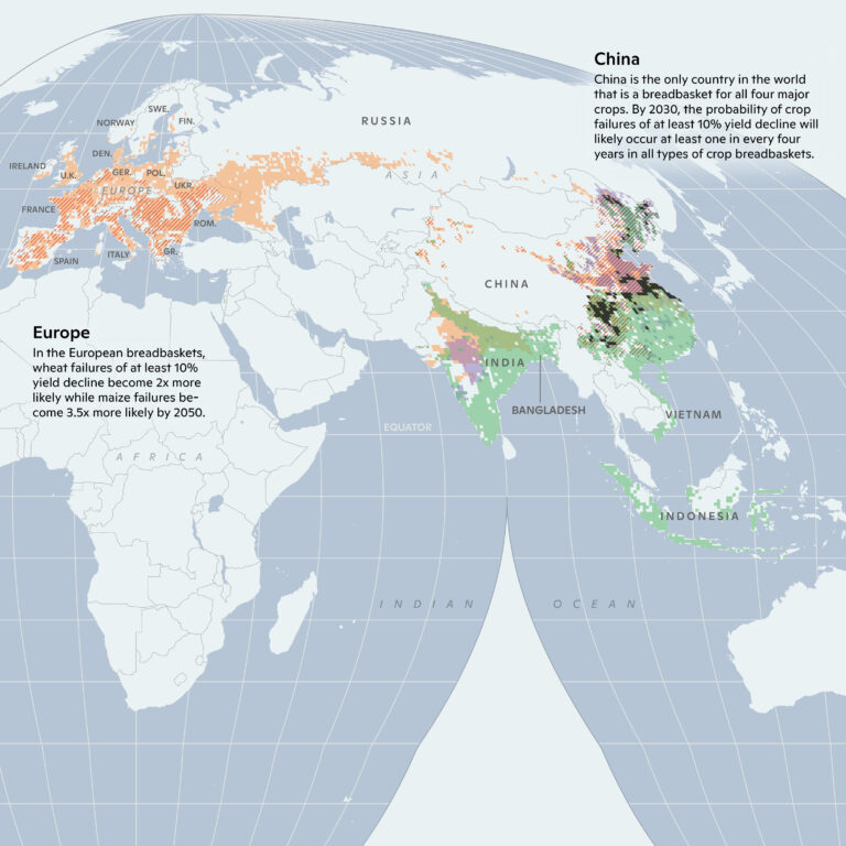
Day 15: Food
Countries’ ability to produce staple crops will become increasingly challenging with climate change. / map by Christina Shintani, data provided by Monica Caparas
Day 16: Minimal
Woods Hole, MA is the headquarters of Woodwell Climate Research Center and home to our institution since 1985. Presently about half of our staff work remotely from locations across the country and globe. / maps by Greg Fiske, Christina Shintani
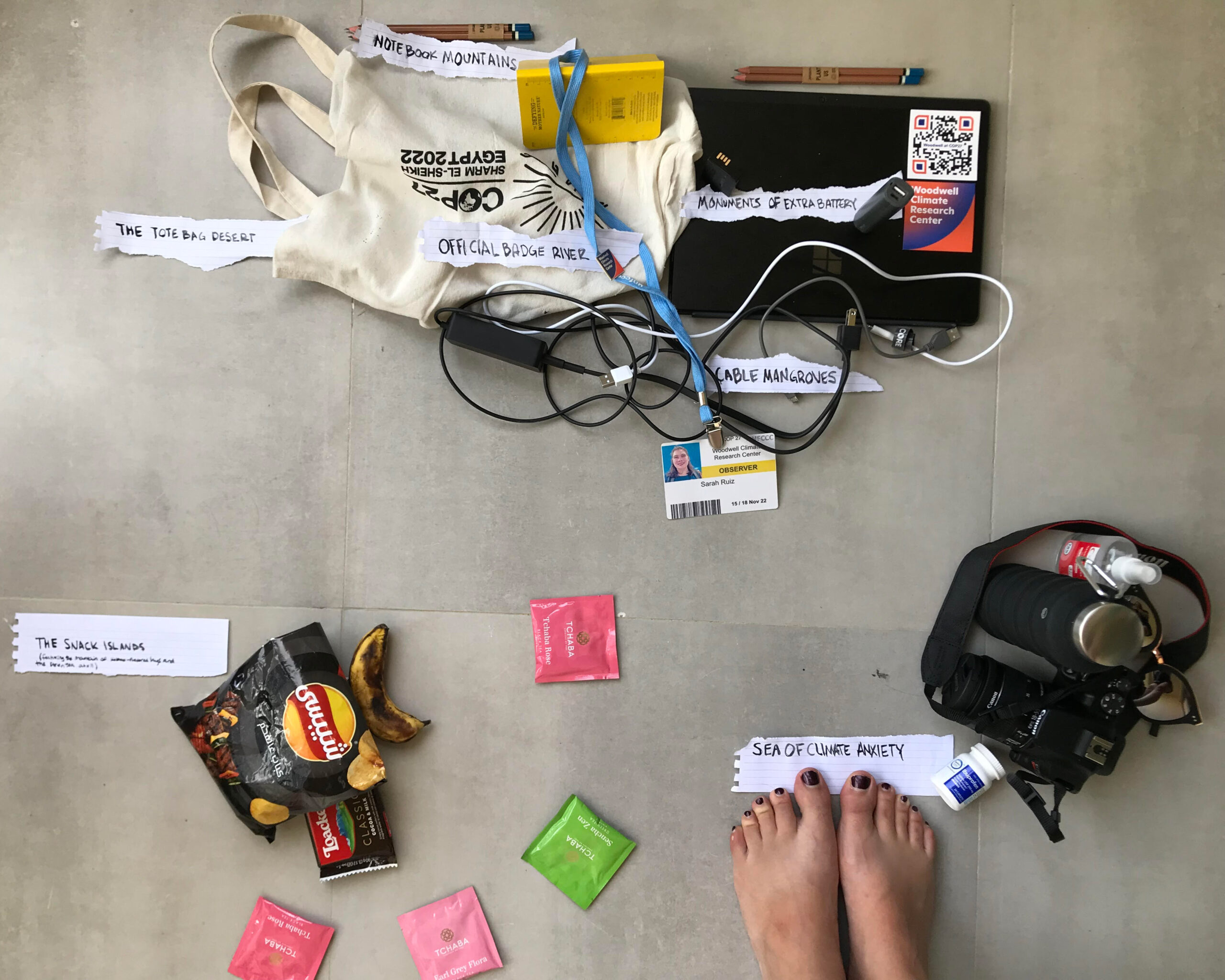
Day 17: Map Without a Computer
Science Writer Sarah Ruiz, navigated her way through cable mangroves, the monument of extra batteries, a tote bag desert, the snack islands, and a sea of climate anxiety, while at COP27. / map by Sarah Ruiz
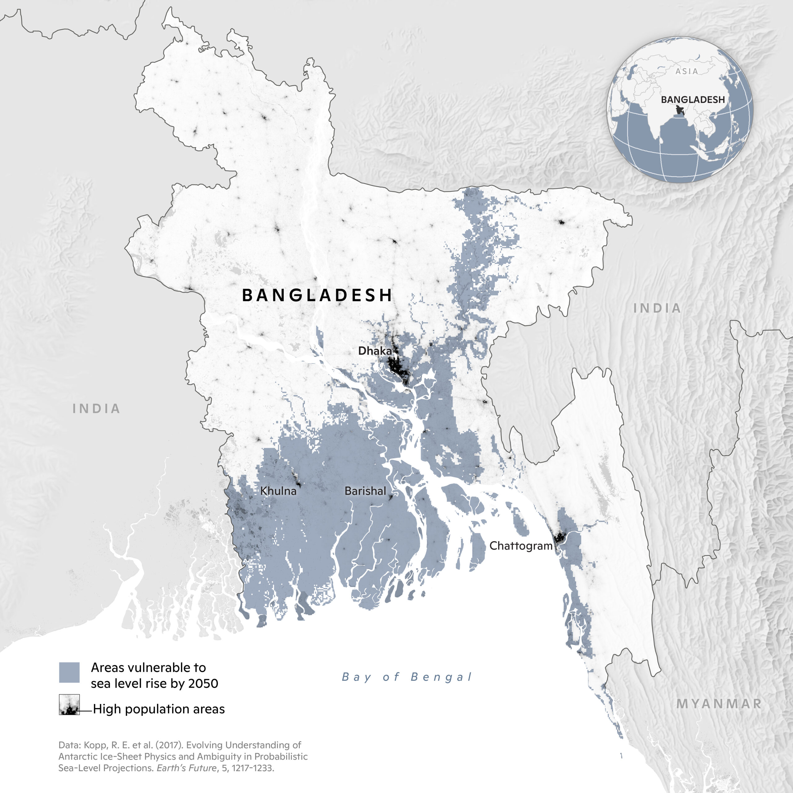
Day 18: Blue
As a flat, low-lying country, Bangladesh is largely covered by the Ganges Delta, the largest river delta in the world. Due to climate change, a large portion of the country will be vulnerable to sea level rise by 2050. Bangladesh is the 8th most populous country in the world. It’s estimated that by 2050, one out of every seven people there could be displaced. / map by Christina Shintani
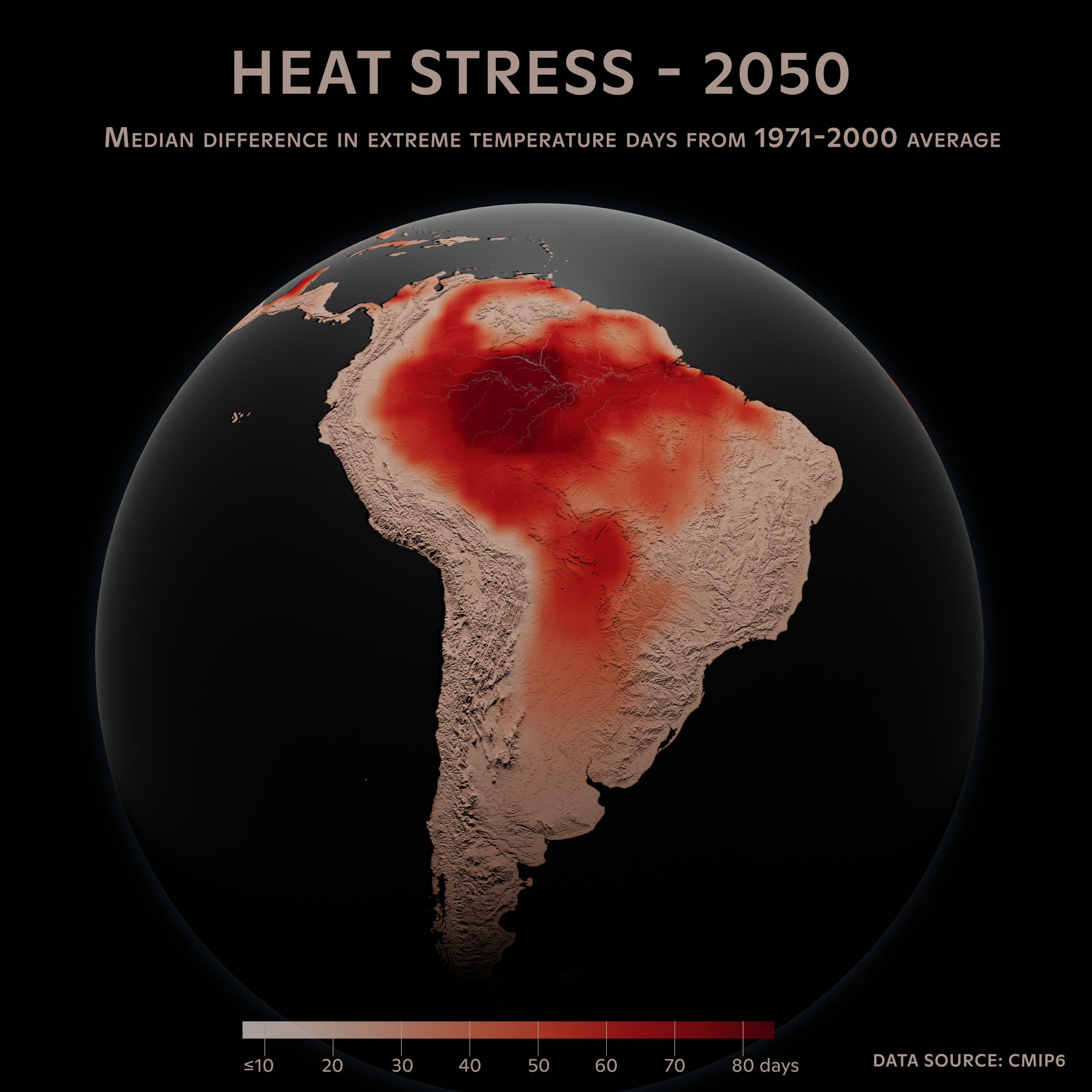
Day 19: Globe
The Amazon will be under extreme heat stress in the year 2050. The data uses scenario SSP585 (CMIP6) which currently represents the upper extreme of change scenarios described in scientific literature. / map by Greg Fiske
Day 20: My Favorite
From paella to mango sticky rice, we bet one of your favorite meals includes rice. While rice is a global favorite starch, much of it is produced in southeast Asia. The probability of rice yields failing in the future due to climate change will increase. This map highlights top-producing rice regions, where rice yield failures will have a large impact. / map by Christina Shintani, data provided by Monica Caparas

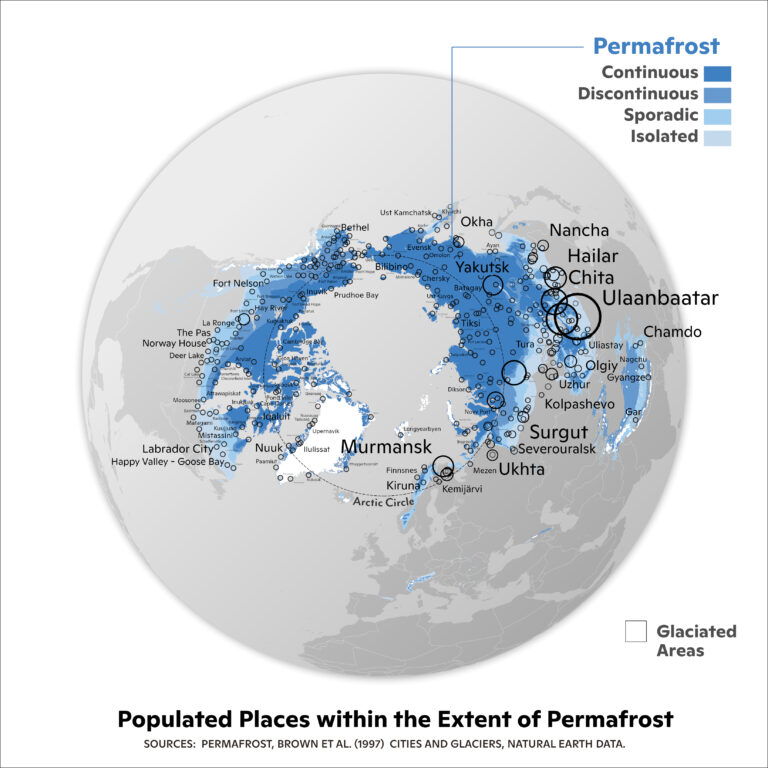
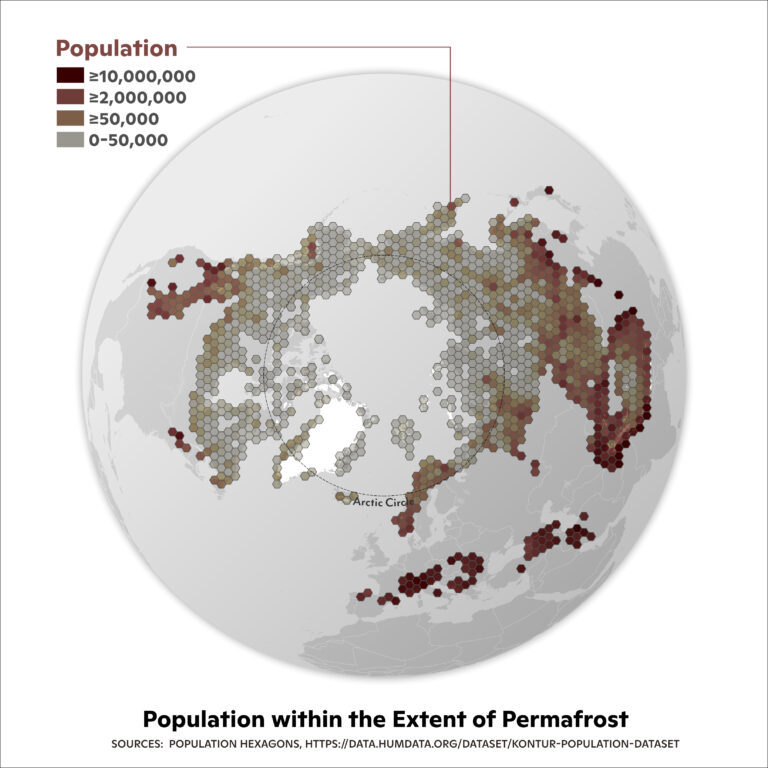
Day 21: Kontur Population Dataset
The Arctic is home to more than four million people. Folks in this region are seeing the impacts of climate change at a more rapid and pronounced rate than lower latitudes—in some cases having the ground they live on erode out from underneath them. / maps by Greg Fiske
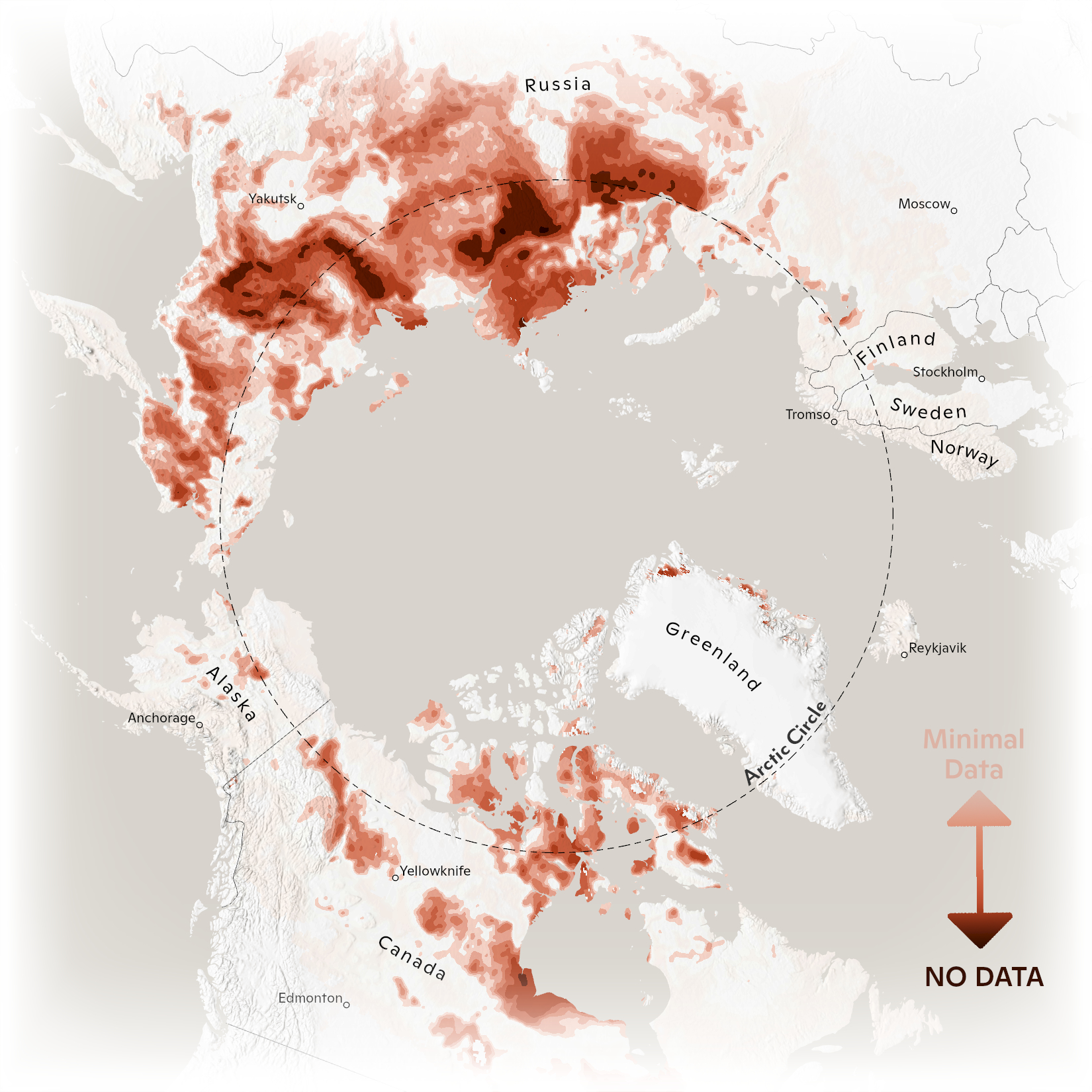
Day 22: Null
Currently, severe permafrost monitoring gaps persist across the Arctic because data collection in these environments is challenging. Woodwell’s Permafrost Pathways aims to fill these gaps over the next several years by installing new carbon flux towers and monitoring equipment. / map by Greg Fiske
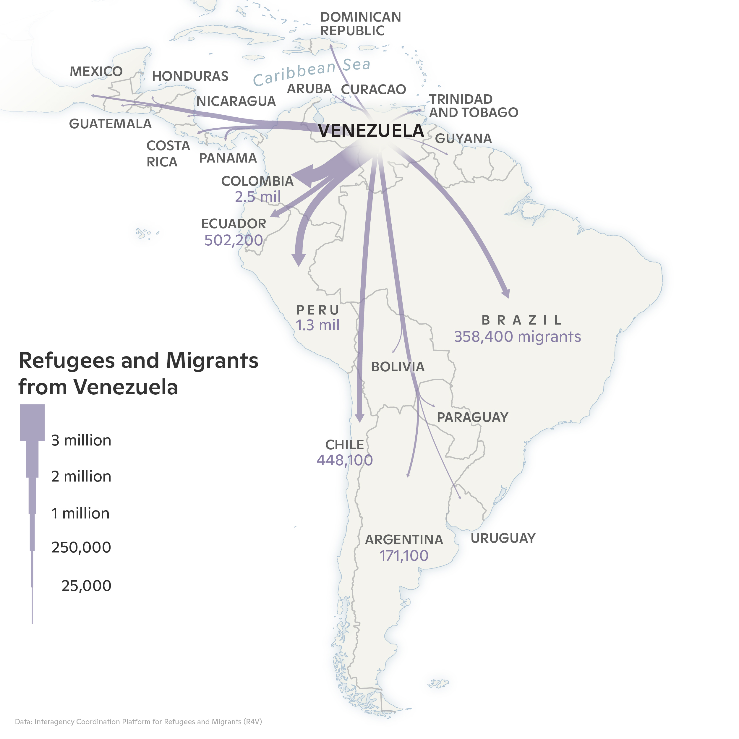
Day 23: Movement
More than 7 million Venezuelans have left their homeland since 2015, seeking refuge from an extended political and economic crisis. Human migrations of this scale are likely to be more common under climate change. / map by Christina Shintani
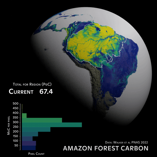
Day 24: Fantasy
The urgency of climate change demands that we make fantasy a reality by realizing the full potential of forest-based natural climate solutions. The Amazon currently has an unrealized potential to store approximately 21 additional petagrams of forest carbon. / map by Greg Fiske, Seth Gorelik
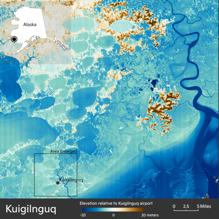
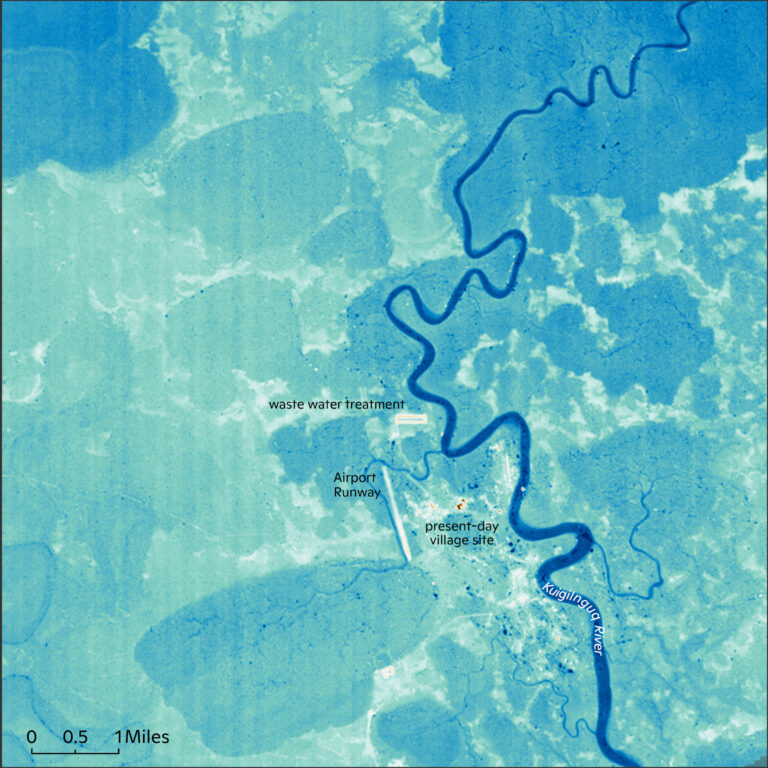
Day 25: Two Colors
Due to flooding, erosion, and thawing permafrost, the Alaska Native village of Kuigilnguq is facing the difficult challenge of moving from their ancestral homelands to a new location (potentially to the north and east). This map shows all the areas that are higher in elevation than their current airport runway elevation (brown) and below (blue). / maps by Greg Fiske
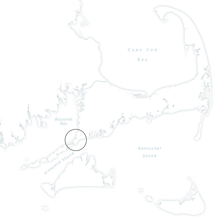
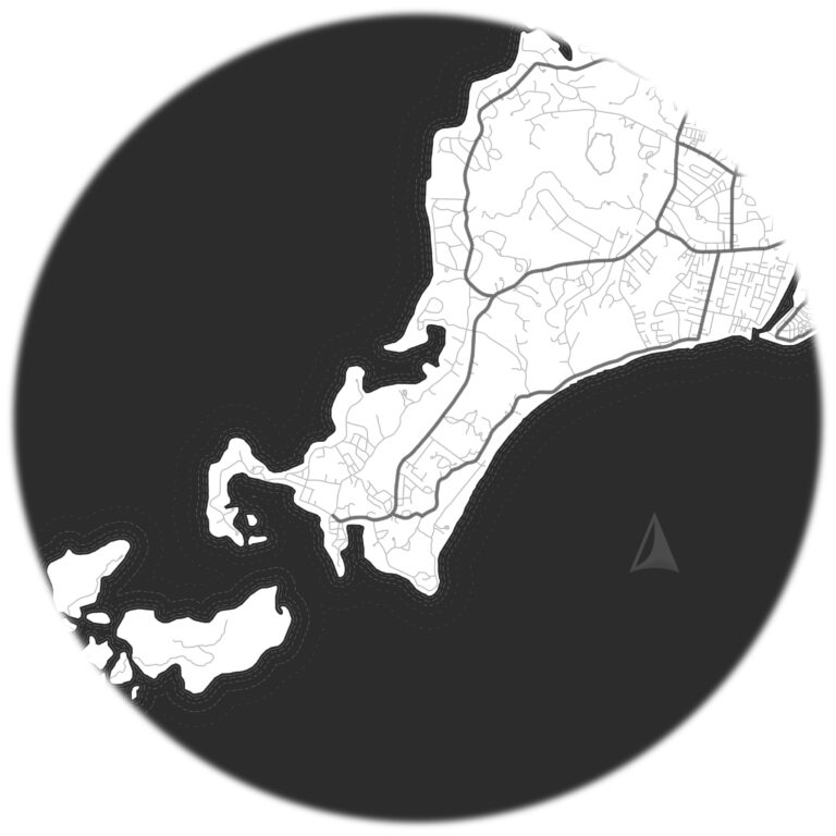
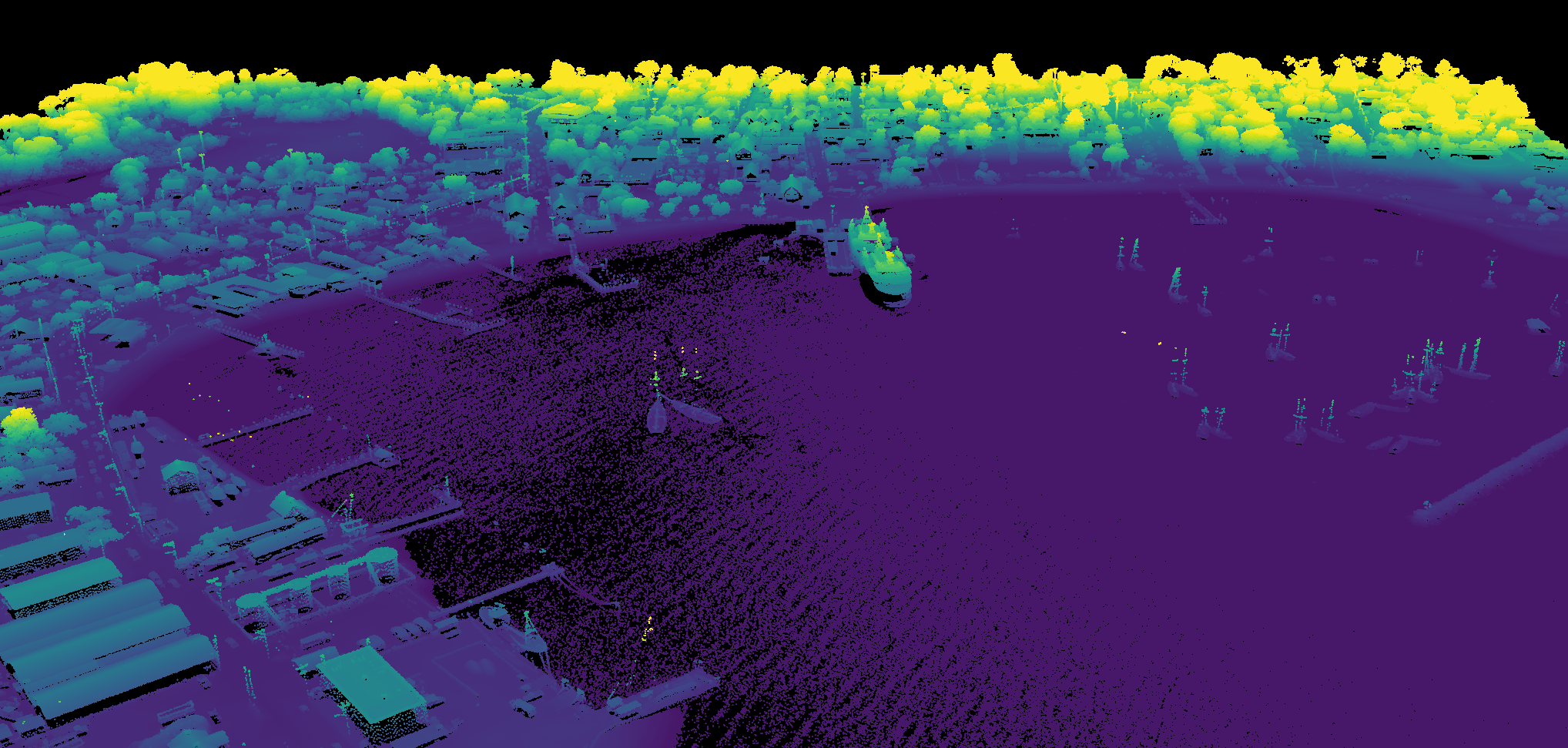
Day 26: Islands
Woodwell Climate is using airborne LiDAR data to understand carbon storage in forests as a natural climate solution on Martha’s Vineyard, a 96 mi2 island off the Massachusetts coast. LiDAR is reminiscent of pointillism, the impressionist painting technique, but in three dimensions. Here the image is made up of thousands of individual point locations, which are colored by elevation above sea level: at/near sea level is blue and the tallest objects (e.g., tree tops) are yellow. / image by Wayne Walker
Day 27: Music
Music can enhance the accessibility of our data visualizations. Woodwell’s Kathleen Savage has matched a set of drums to our animation of the Scotty Creek fire in Canada allowing more to experience the explosive nature of this burn event. / map by Greg Fiske, Kathleen Savage
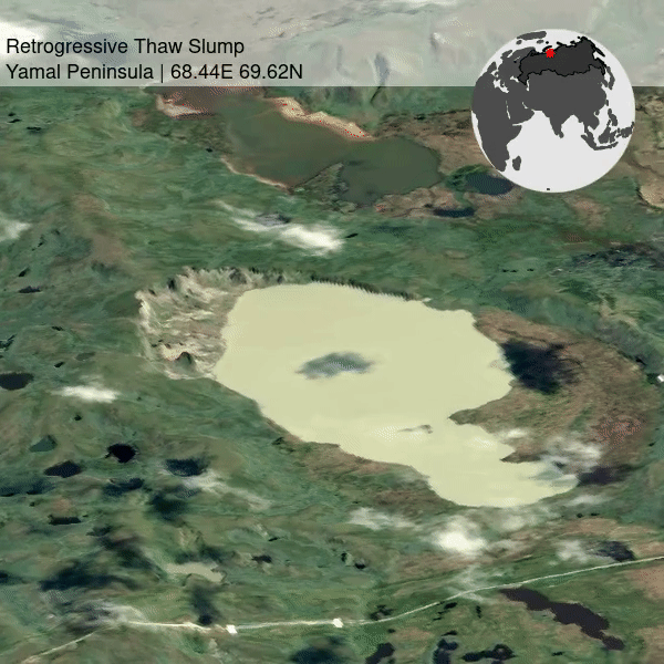
Day 28: 3D
Retrogressive thaw slumps are a form of abrupt permafrost thaw responsible for releasing CO2 to the atmosphere. Wide-spread and newly formed Retrogressive Thaw Slumps are abundant in the Yamal and Gydan region of Siberia. / map by Heidi Rodenhizer
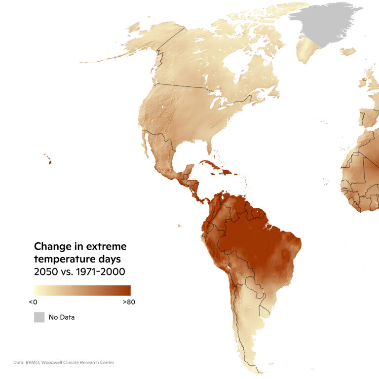
Day 29: Out of my Comfort Zone
This map depicts how many extra days will exceed the historical (1971–2000) 95th percentile extreme temperature in 2050. / map by Christina Shintani
Day 30: Remix
The month’s maps, all in one image file.